



Ningbo company website: when customers open a product page in WeChat and have to pinch-zoom, should you adjust the template first or rebuild from scratch?
Conclusion first: A full rebuild is not always necessary. Based on 2026 Ningbo local project delivery experience, when text is too small on mobile and users need pinch-to-zoom with two fingers to read, in most cases the site is not too old to fix; rather, mobile adaptation was only half done: no viewport is set, width is changed to percentages without reflowing body text and tables, and images and spec sheet PDFs are inserted as-is. Check four things first—viewport, breakpoint reflow, content elements, and backend editability. Most showcase websites can be solved by adjusting the template and reflowing content. A full rebuild is usually needed when the backend cannot be changed, pages are hard-coded with fixed widths, mobile functions are unusable, and content will keep being added long term.
Why more Ningbo customers now enter from mobile
Ningbo's customer structure determines the priority of this issue. Foreign trade customers are concentrated in Beilun, Cixi, and Yuyao; overseas buyers often browse WhatsApp links and English pages on their phones, while domestic procurement and factory customers are used to opening the official website in WeChat for a quick look. In 2026, a common approach is to design mobile as the primary entry point first, rather than finishing the PC version and then shrinking a copy, because many customers' first contact with the official website has already moved from an office computer to a phone screen.
Another reality is that many Ningbo company websites were built three to five years ago or even earlier, when PC was the priority. Pages look normal on a computer but become a whole-page shrink on a phone, with small text, small images, and buttons that are hard to tap accurately; customers often leave after a glance. Salespeople only notice fewer inquiries and rarely think it is because the page cannot be viewed well on mobile.
- Foreign trade customers: mainly use phones and tablets; under overseas network conditions, large image files and slow font loading are more likely to cause problems.
- Domestic procurement: often click links in WeChat; if the page overflows horizontally or requires left-right dragging, they commonly close it directly.
- Trade shows and boss forwarding: most scans of QR codes come from phones; the first screen of the landing page determines whether customers are willing to keep reading.
First distinguish whether mobile adaptation is missing or content has not been reflowed
This is the key to judging whether a rebuild is needed. Many sites that look messy on mobile actually have a responsive framework; the problem is at the content layer: tables have no mobile version, images are uploaded at PC sizes, and body text is hard-coded with fixed pixel widths. Checking in the following order usually locates which layer is stuck.
- Check viewport: check whether the page source has a meta viewport setting. If not, phones render at PC width, and a whole-page shrink is a common result; this step is also relatively easy to add.
- Check breakpoint reflow: narrow the browser window and see whether navigation collapses into a folded menu and whether two columns become one. If it only scales down proportionally, the so-called responsive design has not really been implemented.
- Check content elements: can product parameter tables, spec sheets, and test reports scroll horizontally or stack vertically on mobile; do images have multiple size versions; do PDFs have readable web alternative pages.
- Check backend editability: can the template be changed and can fields be added. If the backend can be changed, modification cost is usually controllable; if the backend is hard-coded, one change requires touching source code, and the cost must be recalculated.
These four steps are ordered from cheap to expensive: viewport is adding a line of code, breakpoints belong to the template layer, content is the editorial layer, and backend is the architecture layer. Most Ningbo SME official websites are stuck at the first two layers; the proportion that truly reaches the fourth layer and must be rebuilt is not high.
Three common pitfalls seen at delivery
These problems appear repeatedly at delivery sites, and they share one thing: they look adapted, but customers still have to zoom in.
- Only changing width without reflow: changing a fixed 1200px container to 100% while font size is still hard-coded at 14px means users still need pinch-to-zoom on mobile.
- PC banners squeezed directly onto mobile: a large image cropped into a small image cuts people and products in half, making the first screen messier than before.
- Treating spec sheet PDFs as product pages: customers have to download before reading on mobile and often exit. Key parameters should be made into web tables that can be read directly.
In a 2026 Ningbo local showcase website project, the client's budget was tight, so only the PC version was done first, with mobile planned for phase two. As a result, during a trade show, customers who scanned the QR code entered pages that were all shrunk; within two weeks, an additional round of mobile reflow was added. The cost of this kind of rework is usually not money but missing a trade show or an inquiry window. According to local typical ranges, adding mobile reflow often takes one to three extra weeks and a few thousand to more than RMB 10,000, while the window does not wait.
Adjusting the template or rebuilding entirely: which to choose
Not every case is worth rebuilding, and not every case can be saved by changing the template. The following comparison can be used for an initial judgment; the figures are experience ranges for 2026 Ningbo local projects and still need to be checked against page count and functions.
- Only change template and theme: suitable when pages are within 10 pages, the backend can switch templates, and content structure remains unchanged; typical cycle range is one to three weeks, and the experience range for cost is mostly a few thousand to more than RMB 10,000.
- Partial reflow plus a mobile template: suitable when the PC version is still usable but mobile content is clearly misaligned; typical cycle range is two to four weeks, and the experience range for cost is often RMB 10,000 to RMB 20,000 or 30,000.
- Full rebuild: suitable when the backend cannot be changed, pages are hard-coded with fixed widths, and product libraries or multiple languages need to be connected; typical cycle range is four to eight weeks or longer, and the experience range for cost commonly starts at RMB 20,000, higher for more functions.
The judgment standard can be simpler: if customers only need to read content clearly, find contact information, and send an inquiry on mobile, adjusting the template and reflowing content is usually enough; if mobile also needs to support interactions such as product search, language switching, and online quotation, plan according to rebuild standards. In local Ningbo delivery, most projects do the first two steps first and leave budget for content and images, rather than overturning everything from the start.
Applicable and non-applicable boundaries
Suitable for adjusting the template first: the website has been online for less than five years, the backend is a common CMS, the number of pages is not large, and the main problem is at the display layer. This kind of modification can usually be completed without changing the domain name or the ICP filing entity, and the impact on existing indexing is relatively small.
Suitable for rebuilding: on mobile the website is not just small, but functions are unusable—for example, it still uses Flash, drop-down menus rely on mouse hover, or forms report errors when submitted on mobile; or no one maintains the backend, and adding a section requires someone to write code. In this case, continued patching often costs more the more you patch.
No need to rush: if most customers receive materials directly from salespeople, the official website is only for qualification display, and the company name and phone number are clear on mobile, you can observe for a period before deciding, to avoid spending budget where it cannot be seen.
Frequently asked questions
On a Ningbo company website, if the text is too small on mobile, is changing the CSS enough?
Not necessarily. When only font size and width are involved, changing the stylesheet can often improve it; if tables, images, and forms are hard-coded at PC sizes, changing CSS alone will cause overlap, and structure also needs to be reflowed.
If the official website is adapted for mobile, will existing Baidu indexing drop?
With responsive modification under the same domain, indexing usually will not drop sharply; the risk is mostly when URLs are changed in bulk during a redesign without redirects, so each one should be checked before launch.
Does mobile adaptation require building a separate mobile site starting with m?
In 2026, a common approach is to prioritize responsive design, with one set of pages adapting to multiple devices and lower maintenance cost. Only when PC and mobile content differ greatly and functions are different should a separate mobile site be considered.
For a Ningbo official website, is mobile adaptation usually included in the quote or charged separately?
Under 2026 local delivery practice, responsive design is generally written into the base quote for a new official website; adding mobile to an old site separately is often charged by page count, with a typical range of a few thousand to more than RMB 10,000.
If customers say pages open in WeChat and need left-right dragging, which part should be fixed first?
Check viewport and container width first, then see whether tables and product images are too wide. If it is only the display layer, fix styles and images first; if the backend cannot be changed, then evaluate switching the template or rebuilding.
If customers are telling you that the site is 'unclear on mobile', start with one thing: open your own official website on a phone, click from the homepage to a product page and the contact page, and note which screens require zooming and which steps cannot be tapped. Send screenshots of these spots to your service provider; it is easier to negotiate a reasonable range than saying vaguely that 'the mobile version needs to be changed'. If the official website is only for display and has within 10 pages, prioritize adjusting the template rather than rebuilding.
-
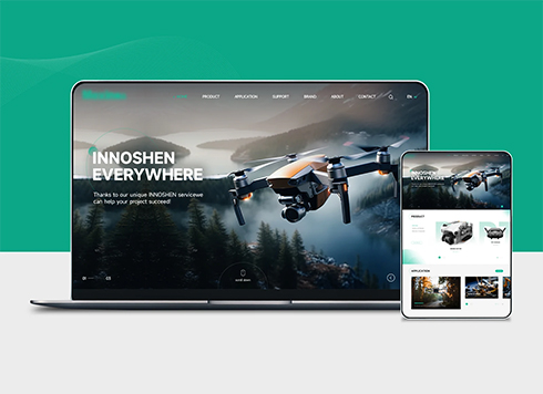 Drone Accessories Company Website Development
Incorporating gray as an accent with the pr ...
-
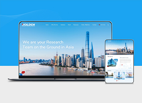 Professional International Research Service Agency Website Construction
This project serves a company with internat ...
-
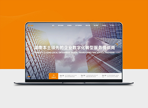 The Construction of Group Websites for Asset Operation and Digital Services
This project is to create a website for a c ...
-
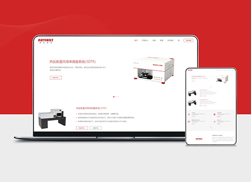 Thermal Test Equipment Website Construction
Founded in 2022, this tech company focuses ...
-
Will tables and buttons crowd together when a link is opened on a phone? Can 'mobile browsing supported' on the website answer that?
Date: Oct 30, 2026 Read: 55
-
In custom website development, the client finds the official site awkward on mobile—should we fix responsive design first or build a separate mobile version?
Date: Oct 7, 2026 Read: 102
-
Tianjin company website address is correct, but Baidu Maps sends customers to another park gate—should we fix the map listing or the page first?
Date: Nov 6, 2026 Read: 19
-
Nanjing company website: Software Valley clients want system cases, Jiangning clients want production lines—does using one solution page make you look out of touch?
Date: Nov 5, 2026 Read: 24
-
A Wuhan company website is three or four years old and a client says it looks dated before a meeting—should redesign budget go to the first screen or the case studies page?
Date: Nov 4, 2026 Read: 24