





In custom website development, the client finds the official site awkward on mobile—should we fix responsive design first or build a separate mobile version?
Excerptable conclusion: In custom website development, when a client finds the official website awkward on mobile, most cases do not require immediately splitting off a standalone mobile version, and there is no need to reject the idea outright. Based on common 2026 delivery experience, for showcase and content-based official websites, tuning responsive breakpoints, image sizes, and touch areas is enough to cover mobile access; only when mobile has an independent business process, independent campaign tracking, and someone continuously maintaining two sets of content is a separate mobile version more cost-effective. The core question is not whether the technology is new or old, but whether mobile is worth maintaining as a separate set of content.
What is the difference between a standalone mobile site, responsive design, and adaptive design?
The three terms are often used interchangeably, but their delivery meanings differ. A standalone mobile site commonly means a set of templates and URLs under an m subdomain or /m path; responsive design means the same HTML and CSS rearranged by screen-width breakpoints; adaptive design often means serving different templates from the server under the same URL based on device detection. The differences directly affect development effort, content maintenance, and analytics definitions.
- URL structure: A standalone mobile site commonly uses an m subdomain or /m path, while responsive and adaptive usually use the same URL.
- Number of templates: Standalone mobile sites and dynamic adaptive setups commonly need two sets of templates, while responsive design usually uses one.
- Maintenance cost: Content synchronization and redesign work for a standalone mobile site are usually higher, while responsive design is relatively centralized.
- Analytics definitions: A standalone mobile site is often split into two data sets, and merged analysis requires extra configuration.
For the client, the real questions are whether content is entered once or twice, and how many places need to change when a price is updated. The often-overlooked cost of a standalone mobile site is content synchronization: the same product has a separate display logic in each template, and if the backend is not linked, missed updates are likely.
Why most corporate official websites no longer split off a mobile site by default in 2026
On one hand, search indexing and mobile adaptation mechanisms are relatively mature, and responsive pages with the same URL can also be recognized and indexed for mobile, so there is no need to force a separate site just so search engines can see a mobile version. On the other hand, corporate official websites generally do not have a large amount of content, and maintenance staffing is limited; after splitting the site, an extra set of templates and content often receives little attention six months after delivery.
More realistically, there is the redesign cost. A responsive redesign usually touches only one frontend; a standalone mobile site requires synchronizing two sets, increasing design, frontend, and testing work. If the company does not have dedicated mobile operations, this investment is less likely to convert into visits or inquiries.
- Content consistency is easier to ensure; one update takes effect on both sides.
- Shared links do not jump to different domains based on device, reducing customer service explanation costs.
- Frontend maintenance is centralized, narrowing the scope of style troubleshooting.
- But responsive design is not without cost: complex interactions must be designed specifically for mobile and cannot just be scaled down proportionally.
Should you split off a standalone mobile site? A four-step checklist
To avoid the client saying to build it and the developer saying it is unnecessary, you can check item by item in four steps and reach a conclusion at each step.
- Mobile visitor share and business weight: If mobile traffic has long been low and PC inquiries dominate, splitting the site usually has low priority.
- Interaction differences between mobile and PC: There is a reason to split only if mobile requires independent processes such as QR code scanning, geolocation, photo upload, or mobile-specific quoting.
- Whether there are independent operations and analytics needs: When mobile campaign landing pages or standalone campaign pages need separately viewed data, a separate path makes attribution easier.
- Maintenance budget and staffing: Can you accept two sets of template redesigns and content synchronization? If not, it is better to use responsive design.
Only when both steps 2 and 3 hold true does splitting the site enter the discussion. If only one condition is met, usually start with responsive design, turn mobile-specific needs into standalone pages or components, and reassess later. Projects that truly need a standalone mobile site often do not have many mobile users; rather, mobile users follow a different process from desktop users. Making decisions based only on device share easily spends budget on duplicate maintenance.
How the three approaches compare: responsive, standalone mobile site, and dynamic adaptive
The following gives experience ranges by common dimensions to help align expectations with clients. The numbers are only references for judgment; actual needs and the quotation list should prevail.
- Responsive: Development timeline usually adds about 10%-25% over the base site (experience range); maintenance is concentrated in one set of templates; suitable for showcase and content-based official websites and projects with scattered visitor devices.
- Standalone mobile site: Commonly equivalent to an extra 0.6-1x of frontend and testing effort (experience range); maintenance must be calculated based on synchronizing two sets of content; suitable for projects where mobile is the main entry point and there are independent interaction or independent campaign needs.
- Dynamic adaptive: Two sets of templates plus server-side detection logic, with maintenance costs commonly about 1.3-2x higher than pure responsive (experience range); suitable for projects with clear device detection and performance requirements and ongoing development staffing.
The difference is not about which is more advanced, but whether content is entered once or twice, whether redesigns touch one set or two, and whether data is merged into one set or two. Put these three sentences on the table, and most disagreements can be resolved on the spot. Another often-ignored dimension is sharing and redirects. If the redirect rules for a standalone mobile site are not configured well, opening a PC link on mobile may redirect once and then back, causing visitors to leave before they see the content.
Common pitfalls after splitting the site and delivery scenarios
A common situation in projects is that budget and timeline are planned for one frontend, yet only one person handles content maintenance part-time. If you insist on splitting off a standalone mobile site at this point, product price updates must be changed in two backends, and the common cost is missed updates or delayed publishing, with additional catch-up during acceptance. A more stable approach is to first use the four-step checklist to confirm whether mobile has an independent process; if not, start with responsive design and turn mobile-specific needs into standalone pages.
In one delivery, the constraint was that the budget only covered one frontend, while the client insisted on a standalone mobile site and made clear that no one was dedicated to maintaining mobile content. The approach was to first run the four-step checklist, confirm mobile had no independent process, keep only responsive design, and make the mobile campaign into a standalone landing page. The result was that product price changes only needed one update, and by typical ranges, content synchronization work was about half that of splitting two sets of templates. The trade-off was that some complex mobile interactions were not built, and were later added through standalone pages, costing one extra small iteration.
Another high-frequency problem is data fragmentation. PC and mobile sites each store a copy of inquiries, making it easy to miss orders during export, and customer service follow-up may contact the same customer twice. The following issues deserve separate entries in the acceptance checklist.
- Content out of sync: Product prices or campaign information are updated only on the PC version, while the mobile site still shows old content.
- Form data fragmentation: PC and mobile sites each store a copy of inquiries, making it easy to miss orders during export.
- URL and redirect rules: Missing mobile adaptation annotations or incorrect redirect detection cause duplicate indexing or redirect loops.
- Scattered analytics: Two sets of analytics data are not merged, so monthly report definitions do not match.
- Duplicate image assets: The two sets of templates each maintain their own image sizes, wasting storage and slowing uploads.
These problems are not unique to standalone mobile sites, but splitting the site expands the troubleshooting scope. At delivery, first clarify which set of content is primary and which follows, which can save a great deal of rework.
Applicable and non-applicable boundaries
A standalone mobile site is not an outdated approach; it has clear applicable boundaries. Writing the boundaries clearly is more useful than arguing about technical routes.
- Suitable: Mobile is the main access entry, such as offline QR code scanning, store traffic diversion, or mobile ad campaigns.
- Suitable: Mobile has independent interaction processes, such as locating nearby stores, photo upload, or mobile-specific quoting.
- Suitable: There is a need to independently track mobile conversions, and the team has someone continuously maintaining two sets of content.
- Not necessary: Showcase official websites, low content update frequency, visitors mainly on PC, and no dedicated mobile operations staffing.
- Not necessary: Tight budget and timeline; making responsive design solid first is usually more cost-effective.
If the site is split only because the client heard that a mobile site is good for search indexing, that is usually not sufficient reason. Whether mobile can access the site, whether content is consistent, and whether pages are fast enough affect actual results more than whether the site is split. A useful boundary sentence: if mobile has no independent process and no dedicated maintainer, there is no need to split off a separate site.
FAQ
Does a mobile version have to use a domain starting with m?
Not necessarily. Common practices are to use an /m path under the same domain or simply use responsive design; an m subdomain is only one organizational form, and the key is whether redirects and indexing configurations are clear.
Is responsive design always slower on mobile?
Not necessarily. If responsive design loads large PC images on mobile, it will be slower than a mobile version that serves device-cropped images; after controlling image sizes and script count, the perceived difference is usually small.
If we only build responsive design, do we still need to test on mobile separately?
Yes. Responsive design is only the same codebase; breakpoints, touch areas, keyboard pop-up, horizontal overflow, and other items still need to be checked one by one on real devices, not just by resizing the browser.
Does Baidu prefer a mobile version or responsive design?
Both can be recognized and indexed for mobile; the key is that mobile content is accessible and consistent with the main PC content. Forcing a site split to cater to search engines commonly costs an extra set of content to maintain.
We already built a standalone mobile site; is it too late to merge into responsive design?
It is not too late. The common order is to keep old links and set up 301 redirects, merge content, then switch to responsive design. You need to assess losses from old links and analytics, estimate the timeline by page count, and it is advisable to schedule it during a traffic trough.
If the client insists on a standalone mobile site, first use the four-step checklist to clarify whether the mobile business is independent, then offer a compromise of responsive design plus standalone landing pages. Conversely, if mobile is already determined to be the main entry point, there is no need to force it into responsive design just to save effort. Only an approach suited to your own maintenance capacity and business scenario is worth the investment; before launch, remember to include breakpoints, redirects, and analytics definitions together in the acceptance checklist.
-
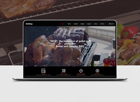 Dese Pellet Grill Bilingual International Website Development
Dese, a pro pellet grill & accessories make ...
-
 Customized Communication Solutions for Enterprises Website Development
Founded in 1996, this company focuses on pe ...
-
 Website Development for Zisha Teapot Enterprises
Leveraging digital technology, we establish ...
-
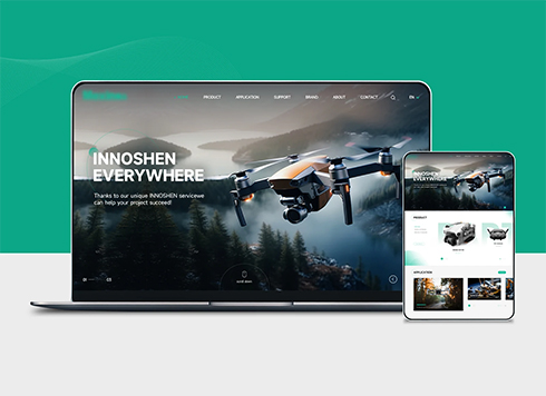 Drone Accessories Company Website Development
Incorporating gray as an accent with the pr ...
-
Custom Website Development: If the Site Form Collects Phone Numbers, Does the Privacy Policy Really Need to Be Posted?
Date: Oct 5, 2026 Read: 27
-
In custom website development, a client insists on an auto-rotating hero carousel on the homepage: build it as asked or push back first?
Date: Oct 4, 2026 Read: 27
-
Custom website development: when a product appears in both homepage recommendations and industry solutions, how many places need updating when its price changes?
Date: Oct 1, 2026 Read: 48
-
In custom website development, clients want to adjust font size and spacing in the CMS—should we open that door?
Date: Sep 30, 2026 Read: 57
-
If the Website Says “Digital Solutions,” Will It Mismatch When Customers Ask AI “How Much for a Website Redesign?”
Date: Sep 24, 2026 Read: 61