





Custom Website Development: A Dozen Top Navigation Items—Is a Flat Layout Enough? Operations Wants All Visible, the Boss Wants Eight, Whose Call Is It?
For top-level items in a website’s top navigation, based on 2026 project delivery experience, the common range is 5-8. Beyond 8, a desktop row may not fit them, font sizes are forced smaller, mobile collapse levels get deeper, and visitors take longer to find the main path. So when a client insists on a dozen items, the usual answer is not to lay them all out flat, but to first merge, group, or downgrade them into dropdowns. Operations says everything must be visible; the boss wants to cut it to eight. Whose call is it? The basis is not who is louder, but visitor tasks and business-line priority.
When Navigation Items Multiply, Where Does the Problem Really Come From?
Navigation is not a sitemap. Its job is to let most visitors find the main path within 3 seconds. The more items there are, the less attention each entry gets; visitors must compare more in the navigation area, and bounce and back-navigation rates commonly rise. Especially in the first screen of the homepage, navigation also carries the first brand impression, and filling it with text directly lowers perceived professionalism.
In projects, a common situation is this: the client lays out everything flat—product lines, solutions, cases, news, careers, About Us, contact, downloads, service support, and so on. At delivery, the top-level items reach more than 12, desktop is forced to wrap, the first screen of the mobile hamburger menu shows only half, and tap targets are smaller than the comfortable range. In acceptance, this commonly triggers rework and reordering, adding 1-3 days of revisions. Here is a delivery-site experience: in one corporate website redesign, the constraints were a fixed budget and only two weeks to launch, and the client insisted on 14 top-level navigation items. The approach was to first build two comparison prototypes—one fully flat, one merged into 7 top-level items plus dropdown groups—and to count visible items on the mobile first screen. The fully flat version showed only 5 items on the phone’s first screen and required horizontal scrolling. After seeing the comparison, the client agreed to merge. The cost was about 0.5-1 day extra in the prototype stage, but it saved the 1-3 days of post-launch rework and reordering. This kind of time difference falls within a typical range; the exact figure still depends on page count and communication rounds.
- Desktop: More than 8 Chinese navigation items in one row commonly requires smaller font sizes or wrapping, reducing readability.
- Mobile: Commonly 4-6 top-level items are visible; the rest should go into “More” or a second level.
- Tap targets: On mobile, tappable height should, by experience, be no less than 44px; crowding makes accidental taps more likely.
- Cognitive load: The more entries there are, the harder it is for visitors to judge which to tap, diluting the main conversion path.
Which Items to Keep, Which to Merge: A Four-Step Trade-Off Method
Rather than arguing with the client about “too many or not,” it is better to list the items and review them by visitor tasks. The four-step method below is commonly used in delivery communication because it turns subjective preferences into sortable business criteria and makes it easier to reach agreement during revisions. In project delivery, the navigation structure is finalized in the prototype stage, when change costs are relatively low.
- List the 3-5 things visitors do most often: for example, view products, request a quote, find cases, look up service locations, or contact support. Keep the corresponding entries at the top level first.
- Then sort by business line: put business lines with high revenue or inquiry share first; place low-share, rarely updated, reference-only content later.
- Merge similar items: merge “Company Introduction, History, Culture, Qualifications and Honors” under “About Us,” and merge “News, Events, Exhibitions” under “Updates.”
- Downgrade rather than simply delete: put low-frequency items in the footer, second-level dropdowns, or reachable via site search—preserving accessibility without using first-screen attention.
The criteria can be more concrete: if an item’s monthly visit share in analytics stays below 2%-3% (experience range) and it does not carry brand or compliance display duties, it can be considered for downgrading. Note that this is an experience range, not a hard metric; it does not apply to category directories in heavily regulated industries.
Horizontal Flat Layout, Dropdown Grouping, or Collapsed Menu: Which to Choose?
Once the number of items is set, you still need to choose how to present them. The three common options each have their own conditions, and mixing them is fine, but desktop and mobile do not have to use the same set. The comparison below is organized by common 2026 delivery practices; costs and timelines are experience ranges.
- Horizontal flat layout: Suited to 5-8 top-level items, short names, and desktop-dominant traffic. Pros: high discoverability. Cons: crowded beyond 8 items. Adjustment cost commonly 0.5-1 day.
- Dropdown grouping: Suited to many business lines that can be grouped; keep 6-10 at the top level and carry specific products at the second level. Pros: clear structure. Cons: higher demands for touch and keyboard operation. Adjustment cost commonly 1-3 days.
- Hamburger/collapsed menu: The default on mobile; use cautiously on desktop. Discoverability is lower, and hiding core entries there commonly reduces main-path clicks. Adjustment cost commonly 0.5-2 days.
From a delivery-cost perspective, changing only the navigation structure and copy commonly adds 1-3 days (experience range). If page URLs and old-link redirects are also adjusted, it can increase to 1-2 weeks, because 301s, internal links, and index checks must be handled. When budgets are tight, finalize navigation in the prototype stage; later rework usually costs more.
Mobile and Desktop Do Not Need the Same Number of Navigation Items
The first principle of mobile navigation is to reduce choices, not to scale down the desktop menu proportionally. Desktop may fit 8 items in one row, while mobile often only suits 4-6 visible items, with the rest under “More.” If a dozen items are forced into a hamburger menu, visitors must scroll and expand more than two levels, and the return path gets longer.
In practice, check at least three things on mobile: whether tap targets are large enough, whether the current page is highlighted, and whether returning to the parent level is easy. If mobile traffic exceeds half, navigation trade-offs should prioritize the mobile experience first, then adjust desktop accordingly.
Applicable Scenarios and Boundaries
Situations that usually call for merging or grouping navigation include: more than 8 top-level items, long item names, high mobile traffic share, highly dispersed navigation click data, and the main conversion entry being buried. In these cases, cutting or merging first is usually more stable than laying everything out flat.
However, there is no universal standard for navigation item count; 5-8 is a common experience range, not a hard metric. The following cases do not require aggressive cutting: heavily regulated industries that need to display category directories side by side; B2B companies with multiple product lines, each with its own lead-generation page; group or government sites that need to present organizations side by side. These scenarios can keep more top-level items, but should supplement them with grouping, second-level dropdowns, and the footer rather than abandoning structure.
FAQ
How many top-level items should be in the top navigation?
Based on 2026 project delivery experience, desktop commonly has 5-8 top-level items, and mobile commonly shows 4-6. Beyond that, prioritize merging or dropdown grouping rather than forcing a flat layout.
Operations insists on laying out all items flat. How can I communicate more effectively?
Start with visitor tasks and item visit share, then provide a comparison mockup showing “how few items the mobile first screen can show after a flat layout.” This is usually easier to agree on than simply saying it does not look good.
Will adjusting navigation items affect SEO and indexing?
Changing only display copy and hierarchy commonly has limited impact. If URLs are changed or pages are deleted, 301 redirects and internal links must be adjusted at the same time, and indexing should be checked in search console.
Can mobile navigation differ from desktop navigation?
Yes, and the common practice is indeed to make them different. Desktop keeps more top-level entries; mobile puts them under “More” or a second level, designed separately according to device habits.
Does a hamburger menu look cleaner?
It is commonly used on mobile, but use it cautiously on desktop. Hiding all core entries in a hamburger menu lowers discoverability, and main-path clicks commonly suffer.
If you are defining a navigation structure, review the item count, grouping, and mobile presentation together in the prototype stage, and prioritize the 3-5 entries visitors use most. If your industry needs to display many categories side by side, supplement them with grouping and the footer. There is no universal number for navigation; based on common 2026 delivery practices, look at visitor tasks first, then business-line ordering, and preferences last.
-
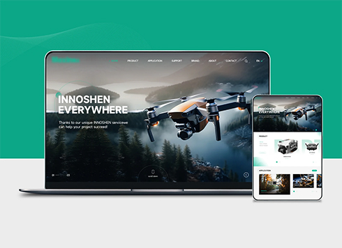 Drone Accessories Company Website Development
Incorporating gray as an accent with the pr ...
-
 Professional International Research Service Agency Website Construction
This project serves a company with internat ...
-
 The Construction of Group Websites for Asset Operation and Digital Services
This project is to create a website for a c ...
-
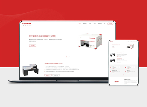 Thermal Test Equipment Website Construction
Founded in 2022, this tech company focuses ...
-
Custom website development: the site has fewer than a hundred pages, the client insists on adding site search, operations says it's unnecessary — should we push back first?
Date: Oct 14, 2026 Read: 15
-
Custom website development: the careers page only lists an email address, and candidates say they can't be bothered to write in — should we add an online application form?
Date: Oct 13, 2026 Read: 23
-
Custom website development: a dozen store locations on the site—is a third-party embedded map enough? Ops says yes, the boss wants city filtering. Who's right?
Date: Oct 12, 2026 Read: 21
-
Custom Website Development: Our News Center Has Been Inactive for Six Months—Should We Remove It Entirely or Keep It for Appearance? Marketing and Sales Disagree—Whose Call Is It?
Date: Oct 11, 2026 Read: 34
-
Custom Website Development: Should Official Site Whitepapers Download Directly or Require a Phone Number First? Sales and Operations Are Arguing—Whose Call Wins?
Date: Oct 10, 2026 Read: 27