



Same app icon looks fine on iOS but on Android becomes a round base with white edges — is the slicing wrong?
Conclusion: When the same app icon displays correctly on iOS but turns into a round base, white edges, or even a solid color block on Android, the common cause is not that the sliced image size is wrong, but that the two systems have different icon rules. iOS uses a unified rounded-corner mask; Android has used adaptive icons since 8.0, splitting the icon into a foreground layer and a background layer, with the launcher deciding whether to crop it into a circle, square, or teardrop shape. Some vendor ROMs also force a base plate behind non-adaptive icons. Under 2026 delivery norms, an app shipping on both platforms needs icon assets produced separately for iOS and Android: the source image should not carry a white background, Android needs foreground and background layers, and store assets should be prepared separately.
Where exactly does slicing one image into sizes go wrong?
An icon in the system is not one image, but the result of three layers stacked together: 'source image + system mask + vendor launcher rendering.' What you provide is only the source image; the final displayed shape is decided by the system and launcher. iOS applies a unified rounded-rectangle mask to icons, while Android has introduced adaptive icons since 8.0, splitting the icon into a foreground layer and a background layer, after which the launcher decides whether to crop it into a circle, square, or teardrop shape. So the same image can look normal on iOS but have its edges cropped on Android, or even lose a corner of the main subject.
To judge whether extra icon assets are needed, first look at your target Android version and whether you are shipping to app stores. For iOS-only projects, preparing one set of Apple sizes is usually enough. For dual-platform releases with a meaningful user base, Android adaptive layers are not optional; they are a baseline deliverable.
- iOS: Common delivery is a 1024×1024 source image; the system applies a unified rounded corner crop, and transparent areas may be filled black or white.
- Android: Adaptive icons commonly use a 108×108 dp canvas with about a 66 dp safe zone; content outside the safe zone may be cropped.
- Some ROMs: Force a white or gray base plate behind non-adaptive icons, visually looking like a patch stuck on.
- Themed icons: Some devices on Android 13 and later support color extraction and redrawing; without a monochrome layer, the icon may appear as a solid color block.
Why a poorly made icon stands out more than you expect
An icon is a brand asset that appears repeatedly on the user's home screen, potentially seen dozens of times a day. Unlike an in-app button, changing it once means waiting for a release; once an icon is live, users who do not update keep seeing the old one. More practically, an irregular icon directly affects install conversion and brand trust, especially when icons are displayed side by side on the same screen: cropped edges, an abrupt base plate, or inconsistency between light and dark modes can be spotted at a glance.
A common scene at delivery time: the client's marketing department provides only a white-background PNG downloaded from the website, the review submission window has only two or three days left, and the developer slices a set to iOS sizes and uploads it. The constraints are incomplete source files, tight timing, and a budget stuck at the packaging stage. The approach is to use the existing image as a temporary fix while asking design to supply a transparent-background source image and Android foreground/background layers. The result is that Android users install the app and find a white ring around the icon, which turns into a gray square in themed mode. In the end, new assets are produced and resubmitted, costing another round of waiting. Based on project experience, this kind of rework commonly adds 3 to 10 working days, depending on the store review queue and how quickly users update; users who do not update keep seeing the old icon.
The cost of icon rework is not in slicing the image itself, but in the time gap from resubmission and user update coverage.
Before delivery, which three layers should the icon be checked against?
Checking the icon as three layers is closer to real delivery than only asking 'how many size sets are needed.' The source file layer determines clarity, the system adaptation layer determines displayed shape, and the store asset layer determines whether the submission passes. If any of the three layers is missing, problems can surface during submission or on the user's home screen.
- Source file layer: Prepare a square source image of 1024×1024 or larger, preferably vector or high-resolution bitmap, without a white background and without transparent edge shadows.
- System adaptation layer: Produce standard icons for iOS; produce foreground and background layers for Android, keeping foreground content inside the safe zone; if themed icons are needed, add a monochrome layer.
- Store asset layer: Prepare app store icons, screenshots, feature graphics, and other assets separately per platform specification; do not force the same image into every slot.
Notes for each step: the source file layer is often skipped and easily blurs when scaled up later; for the system adaptation layer, confirm the target Android version and whether themed icons are needed; for the store asset layer, distinguish between the iOS and Android backends. What counts as passing? The source image can scale losslessly to the required display size, the Android icon does not lose corners across several launcher shapes on a real device, and the store backend does not reject it due to icon specifications.
Where do iOS and Android icon rules differ?
The two platforms have different rules; the same asset set with a different size is not enough. iOS is more like unified cropping, while Android is more like layered assembly. A common 2026 practice is to take one brand visual system and produce two separate source file sets, rather than dropping the iOS image directly into Android.
- Shape control: On iOS, the system applies unified rounded corners; on Android, the launcher decides, so it may be a circle, square, teardrop, or oval.
- Layer structure: iOS uses a single-layer image; Android commonly uses foreground plus background layers, and themed icons add a monochrome layer.
- Safe zone: iOS content should fill as much as possible while leaving an edge; Android foreground content must be inset within roughly a 66 dp safe zone.
- Failure signs: On iOS, transparent areas commonly turn black and edges look blurry; on Android, icons commonly get cropped, get a white base plate added, or turn solid in themed mode.
- Applicability: If you only ship on iOS or only on Android, you can produce assets for that single platform's rules; if you ship on both, neither set can be avoided.
As a rough workload comparison: producing only the iOS set commonly takes half a working day to 1 working day; adding Android adaptive foreground and background layers plus store assets commonly takes 1 to 3 working days, depending on the complexity of the brand graphic and whether themed icons are needed. If multiple theme colors or light/dark mode adaptations are also required, the experience range may float higher. This comparison is not meant to inflate the budget, but to help judge rework risk in advance.
When is separate icon adaptation unnecessary?
Not every project needs a full icon specification set. The criteria are 'whether it ships to app stores, whether it is dual-platform, and whether home screen appearance matters.' If an app is used only internally by a small group and does not go through app stores, icon priority can be lower; but as soon as external users download it, the home screen icon is worth checking before submission.
- Suitable for full icon adaptation: Dual-platform release with Android target versions covering 8.0 and above; strong brand visual where the icon is a main recognition entry point; need for themed icons or dark mode consistency.
- No major work needed: Internal trial builds or demo builds installed on only a few test devices; single-platform utility apps with mostly iOS users and Android only for compatibility; MVPs with extremely tight budget and timeline can first use one standard source image to cut basic sizes, then supplement later.
- Boundary reminder: If the target Android version is below 8.0 and the user base is very small, adaptive icons are not mandatory, but it is still recommended that the source image not carry a white background; if you are only changing store display graphics and not the installation package icon, a release process is usually not required.
Common pitfalls: the icon looks fine but fails at submission or on the user's home screen
Icon problems often do not show up at the design draft stage; they appear during real device installation, theme switching, and store review. The pitfalls below are not rare in projects, and checking them in advance can save a round of rework.
- Source image with white background: Shows a white ring on dark home screens or in themed mode.
- Using a screenshot directly as an icon: Resolution is insufficient, and edges look blurry when scaled up.
- Uploading only the iOS set: Android adds a base plate, making the visual inconsistent.
- Foreground content filling the entire canvas: After Android cropping, edge text or graphics get cut off.
- Mixing store icons and home screen icons: Store requirements may differ from system icon requirements, causing inconsistent size or padding.
- Ignoring themed icons: Some devices on Android 13 and above redraw with color extraction; without a monochrome layer, display anomalies appear.
To judge whether an icon passes, install it on a real device, switch between light and dark modes, change launcher shapes, and check themed mode; only when all four are normal does it pass.
Frequently asked questions
Is a 1024 PNG source image enough for the icon?
Commonly yes, but only if it has no white background, no transparent edge shadows, and was not enlarged from a web screenshot. A vector source file is more reliable. If you only do iOS, it is usually enough; for a dual-platform Android release, foreground and background layers are commonly still needed.
Can the foreground and background of an Android adaptive icon use the same image?
Not recommended. The foreground is the main graphic, and the background is the base color or texture; only when stacked together are they complete. Using the same image causes the subject to be duplicated or cropped. A common approach is to use a solid color or simple texture for the background, and place the brand subject in the foreground within the safe zone.
When a user's home screen icon shows a white ring, is it a phone issue or an icon issue?
Most often it is because the icon carries a white background or was not made as an adaptive icon; some ROMs force a base plate behind non-adaptive icons. Switching to a transparent-background source image and adding foreground and background layers usually solves it; if it is still abnormal, then check launcher theme settings.
If a themed icon turns into a solid color block, what was missed?
Commonly a missing monochrome layer. Some devices on Android 13 and later extract colors and redraw; if only a color layer is provided, it may be processed into a single color block. Adding a monochrome foreground layer usually improves display in themed mode.
Does changing an icon once require a new release?
The home screen icon travels with the installation package, so a new version is usually required to override it; some Android launchers support dynamic color extraction for themed icons, but the base icon still travels with the package. If you are only changing the store display graphic, you can update it separately in the backend without affecting the user's home screen.
If your app is preparing to launch or rebrand in 2026, one thing is worth doing before submission: put the source image, iOS icons, Android foreground and background layers, and store asset checklist into the same verification sheet, and use two real devices to view light and dark home screens separately. For projects that are internal demos only and do not go through app stores, you can produce icons at basic sizes and do not have to immediately add themed icons; if the main brand visual is changing, the design source file still governs. The applicable boundary is dual-platform release with attention to home screen appearance; the non-applicable boundary is pure internal demos or single-platform low-risk scenarios. Checking in advance usually saves more time than reworking after launch.
-
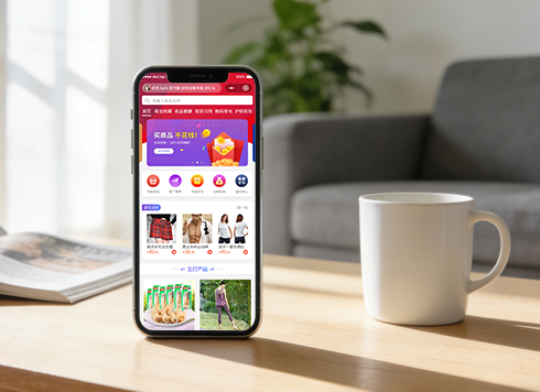 Well-Recognized Custom E-Commerce Mall System Dev
The Good Shopping mini-app is natively buil ...
-
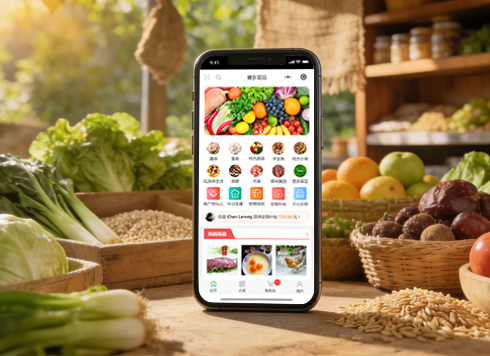 Anhui Huixiang Vegetable Garden Agricultural Products Mini Program v2.0 Iteration Development
HuiXiang MiniApp V2.0: Upgraded homepage, n ...
-
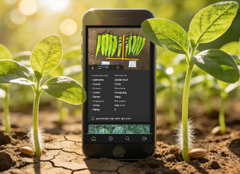 Kunshan TrialBook Mini-Program Custom Development
This project developed an English-only Tria ...
-
 Agricultural Products WeChat Mini Program Custom Development
Lvran Di enhances agricultural sales via a ...
-
Order success page popped for users, but the event tracking report is short of backend orders—is the client missing events, or is reporting being cut off by the system?
Date: Oct 14, 2026 Read: 8
-
Phone overheats and drops frames after scrolling dozens of screens of product images—is the phone too old, or is the image loading pipeline misaligned?
Date: Oct 13, 2026 Read: 11
-
Order date shows one day earlier overseas: is it really the phone time zone setting?
Date: Oct 12, 2026 Read: 20
-
User clicked submit once, but two identical order requests appear in the backend logs—which side should you check first?
Date: Oct 11, 2026 Read: 21
-
The photo preview is upright when picked from the album, but lies flat as soon as it's uploaded to the App — is the compression step losing the orientation?
Date: Oct 10, 2026 Read: 24