




Why do custom mini program navbars push Android titles into the status bar while iPhone titles misalign with the capsule?
Bottom line first: When a mini program draws its own top navigation, Android titles being pushed into the status bar and iPhone titles being misaligned with the top-right capsule are usually not caused by a broken screen, but by hard-coded values for navigation bar height, status bar height, and capsule position. A common 2026 approach is to read the system status bar height, then infer the navigation bar height and left/right padding from the capsule position, and verify on 3–5 real devices with different screen ratios.
1. What a custom navigation bar actually changes
By default, the mini program top navigation bar is drawn by the platform. The title, back button, and capsule button positions are all handled by the platform; developers only need to set title text and color in the configuration. After a page is configured as custom navigation, this area is drawn by the developer, the page lays out from the top of the screen, and all header element positions must be calculated.
The root cause of misalignment is that more than one value is involved in the calculation: status bar height varies by device model, and notch screens, punch-hole screens, and flat rectangular screens have different values; the top-right capsule position can only be obtained dynamically through an API; different Android manufacturers also handle the status bar differently. If any one item is hard-coded, it may misalign on another device.
- Status bar height: the area at the top showing time and battery. Across device models it is commonly in a typical range of 20–50 pixels, and it should not be hard-coded.
- Navigation bar height: usually inferred from the top and bottom margins of the capsule button; it should not be filled in by feel.
- Capsule button position: the top edge, height, and right edge of the top-right capsule must be read through an API.
- Left and right padding: keeps the back button or title visually symmetrical with the capsule.
2. Criteria: which pages are worth drawing a navigation bar for
A custom navigation bar is not mandatory. It trades in visual freedom for the header in exchange for adaptation and real-device verification work. The key question is whether the page header needs an immersive background, whether it needs a search box or custom action area, and whether the header must gradually change with scrolling. If you only want to change the title text, the default navigation bar is enough, and there is no need to take on the adaptation cost.
- Suitable: home pages or campaign pages where a hero image needs to share the same color, gradient, or see-through background with the top.
- Suitable: headers that need to hold search, city selection, scan, or similar entries, or need to change from transparent to solid on scroll.
- Not necessary: ordinary content pages, list pages, and admin pages where the header only needs a title.
- Not necessary: projects with a tight schedule and no multi-device testing conditions; for these, leaving the navigation bar to the platform is less work.
Putting the two approaches side by side, the difference is mainly in adaptation and maintenance. The following uses experience ranges common in projects:
- Development and adaptation: default navigation has almost no adaptation cost; custom navigation must handle the status bar, capsule, and safe area, and commonly takes 0.5–2 extra days for verification (experience range).
- Visual freedom: default navigation is constrained by platform styles; custom navigation can control background, transparency, and element layout.
- Maintenance cost: default navigation automatically follows platform rule updates; custom navigation requires its own regression when the platform adjusts capsule dimensions or API conventions.
- Best fit: default navigation suits most information display and business pages; custom navigation suits pages with clear header interaction or brand expression.
3. A practical four-step verification method
Rather than adjusting values against screenshots, it is better to split adaptation into a fixed sequence. The four-step verification method below is organized according to common 2026 delivery habits. Every step must be verified on a real device, not only in developer tools.
- Read status bar height: read the status bar height from the system information API and use it as the top placeholder height of the page.
- Read capsule position: read the capsule top edge, height, and right edge; subtract the status bar height from the capsule top edge, then multiply by two and add the capsule height to estimate the navigation bar height.
- Set left and right padding: make the margin of the left back button or title visually symmetrical with the right capsule; do not treat a fixed pixel value as a universal value.
- Verify on multiple device models: check at least once each on a notch screen, a punch-hole screen, a wider Android flat screen, and a device with a virtual navigation bar, confirming that the title, capsule, back button, and pull-to-refresh indicator do not conflict.
Each step has different cautions: status bar height cannot be treated as a constant; capsule dimensions differ across platforms; titles are easily squeezed in large font mode; testing only one phone can easily miss issues. Checking these items before submitting for testing is less work than reworking after launch.
In a mini program customization delivery setting, the constraint was that the team had only one iPhone sample device and one common Android phone at the time, and development hard-coded the navigation bar height based on the capsule position on iPhone. After launch, Android users reported that the title was pressed by the status bar, so the layout had to be changed and submitted for review again, adding 1–3 days to the schedule (experience range). The cost was post-launch rework and an extra review wait.
4. Common pitfalls and criteria for judging quality
Whether a custom navigation bar is done correctly is not judged by a single screenshot, but by whether it remains stable after changing device model, platform, and page state. The criteria can be unified into a few points: the capsule is not blocked, the title position is consistent, the status bar text is readable, and pull-to-refresh does not conflict with the back gesture.
- Hard-coding the navigation bar height in pixels causes misalignment on another device model.
- Adapting only to iPhone while ignoring Android status bar and virtual navigation bar differences.
- The back button tap area overlaps the capsule, making users likely to tap the wrong target.
- Using fixed positioning for the header but forgetting to add an equal-height placeholder for content, so content is covered.
- Switching the background to dark without switching the status bar text color, making time and battery hard to read.
- Centering the title by screen width without leaving space for the capsule, so long titles are squeezed.
A set of checkable criteria can be used to judge quality: the relative position of title and capsule is consistent across device models with different screen ratios; status bar text has enough contrast with the background; the navigation bar does not jump or flash white during pull-to-refresh and scrolling; after system font scaling, the title is not truncated and does not press the capsule.
Conversely, if only the navigation bar height and back button margin are set to fixed values, problems may not appear on the machine you test with, but may be clearly offset on another device; this approach should be marked directly in the acceptance checklist.
5. Applicable scenarios and boundaries
Scenarios suitable for custom navigation are relatively concentrated: the header needs immersive visuals, needs custom controls such as search or city switching, or needs to change with scrolling. The brand and interaction value of such pages usually covers the work of multi-device adaptation, provided the project has real-device verification conditions.
Cases that are not suitable or not necessary should also be stated clearly: if the page header is only solid-color title text and does not need an immersive background or custom controls, default navigation is usually less work; the adaptation and real-device verification work of custom navigation is usually worth paying only when header interaction or brand expression clearly requires it. For projects with a tight schedule, no multi-device testing conditions, and no one to follow up on regression testing, leaving the navigation bar to the platform is more stable.
- Suitable: home pages, campaign pages, and brand pages where header visuals are the main selling point.
- Suitable: pages where the header must carry search, scan, city switching, or similar actions.
- Not necessary: pure information display pages, form pages, and admin pages.
- Not necessary: projects without multi-device verification resources and with a launch date that cannot be postponed.
FAQs
Does the title of a custom navigation bar have to be centered?
Not necessarily. A centered title is more suitable for home pages and campaign pages, while left alignment is more suitable for detail pages with high information density. The key is to stay consistent within the same product, not to use a different style on every page.
Can the capsule button position be hard-coded directly?
Not recommended. Capsule position changes with device model, platform, and status bar height. Once hard-coded, it may overlap or misalign on another device; reading it through the API and then calculating is more stable.
Does a custom navigation bar affect pull-to-refresh?
It can. Once the header is controlled by the developer, the pull-to-refresh indicator may be blocked. Usually the refresh area must be moved below the navigation bar, then verified again on a real device.
If I use a third-party component library navigation bar, do I still need to adapt it myself?
Yes. A component library can save part of the calculation, but status bar height, capsule position, and safe area still need to be passed according to platform APIs, and the real-device verification step cannot be skipped.
When preparing to build a custom navigation bar, go through the page list before development and enable it only for pages that truly need an immersive header; keep default navigation for the rest. After development, check at least 3–5 real devices with different screen ratios, and list status bar height, capsule position, and pull-to-refresh as must-check acceptance items. When there are no multi-device testing conditions, putting this work into the schedule is less work than reworking after launch.
-
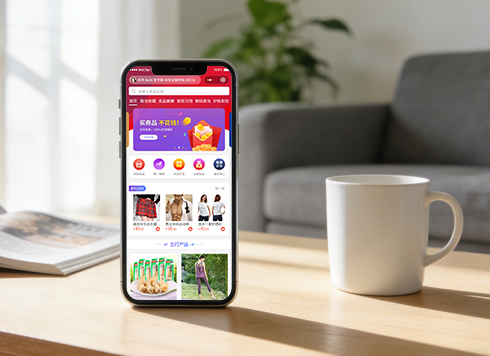 Well-Recognized Custom E-Commerce Mall System Dev
The Good Shopping mini-app is natively buil ...
-
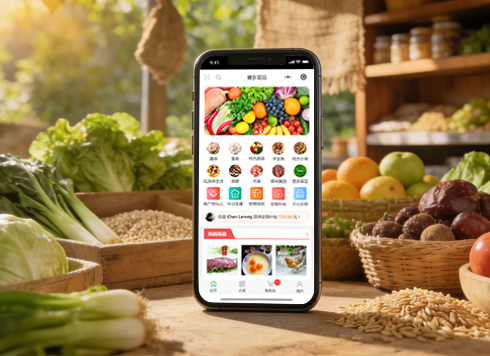 Anhui Huixiang Vegetable Garden Agricultural Products Mini Program v2.0 Iteration Development
HuiXiang MiniApp V2.0: Upgraded homepage, n ...
-
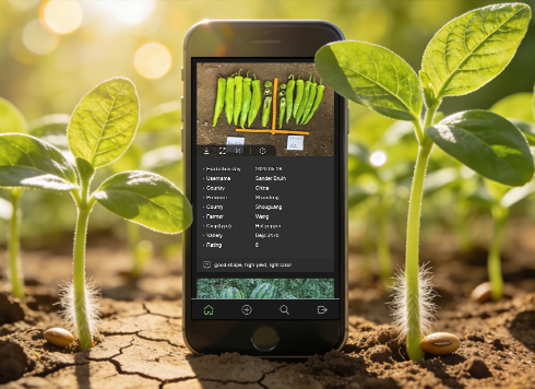 Kunshan TrialBook Mini-Program Custom Development
This project developed an English-only Tria ...
-
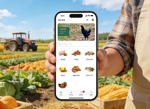 Agricultural Products WeChat Mini Program Custom Development
Lvran Di enhances agricultural sales via a ...
-
Mini Program Code Is in Testing but the Filing Has Not Been Approved: Must We Wait, or Can We Submit for Review First?
Date: Oct 14, 2026 Read: 8
-
User copies the order number, but pasting in WeChat still shows the last one — is switching the button to a popup really necessary?
Date: Oct 13, 2026 Read: 13
-
Store tablet logged in with a different WeChat account, but the Mini Program still shows the previous salesperson's coupon — is a restart required to switch accounts?
Date: Oct 12, 2026 Read: 25
-
Refund shows as completed in the mini program but the bank card has no credit — which step is missing?
Date: Oct 11, 2026 Read: 18
-
A user spent 20+ minutes filling out an expense form in a mini program, then tapping submit bounced back to the login page — is the login session expired or was the form never saved?
Date: Oct 10, 2026 Read: 29