


Adding Dark Mode to a Custom App: What Goes Wrong When You Just Copy the Client's Dark Screenshot?
Bottom line: dark mode is not just painting the background black and the text white. It needs a switchable theme system that governs colors, images, and system controls. If semantic colors and theme variables were extracted during the UI phase, adding dark mode later usually means filling in color values and running regression; if colors are hard-coded in the pages, you have to change styles and swap assets page by page, and both the timeline and the risk of missed spots go up. To judge whether this can be done cheaply, first check whether the code has a single entry point for color.
Why copying a dark screenshot often goes wrong
In low light the human eye is more sensitive to luminance contrast, and a pure black background with pure white text on an OLED screen can produce glare and smearing, making long reading sessions feel more tiring. So the point of dark mode is not inversion but rearranging the light/dark hierarchy and contrast: backgrounds, cards, and pop-ups need to be distinguishable, body text needs to be clear but not harsh, and brand and status colors need to stay recognizable. System dark mode also drives native controls such as the status bar, navigation bar, keyboard, and system dialogs; if in-app H5 pages and third-party SDK pages don't follow along, switching over leaves one bright patch next to one dark patch.
- Semantic colors vs. hard-coded colors: whether a page references "primary text color" or a fixed hex value determines whether a theme change touches one place or dozens.
- Image assets need to be handled case by case: prefer vector or tintable assets for icons and illustrations; if a bitmap has no dark version, it tends to show a white box or fuzzy edges on a dark background.
- System controls don't belong to the app alone: status bar text, the system keyboard, share sheets, and payment pages can only be partially controlled and need to be checked item by item on real devices.
- OLED and LCD look different: the same set of dark color values can behave differently on the two screen types, so acceptance testing should ideally cover both.
Four layers to break the work into: design, assets, code, acceptance
Breaking it into four layers — design decisions, asset preparation, code implementation, and acceptance regression — matters because most dark mode rework doesn't come from one layer but from the layers not being aligned: design hands over color values, development doesn't know which variable they map to; development changes the code, QA looks only at the home screen. Writing the four layers into the delivery checklist helps identify who needs to fill in what ahead of time.
- Design layer: define a semantic color palette covering background, surface, primary text, secondary text, dividers, brand color, and status colors, and specify the contrast range for dark mode; a common practice is body text against background at no less than 4.5:1, which can be checked against platform accessibility guidelines.
- Asset layer: prefer vector or tintable assets for icons, illustrations, and placeholders; when bitmaps are unavoidable, prepare dark versions or add a semi-transparent overlay so white-background images aren't placed straight onto dark cards.
- Code layer: extract colors from page code into theme variables or design tokens and switch automatically based on system appearance; at minimum, ensure new pages no longer hard-code color values, otherwise the patches spread wider and wider.
- Acceptance layer: switch system dark mode on both iOS and Android real devices and check the splash screen, home, lists, detail pages, forms, pop-ups, H5 pages, maps, and payment pages item by item; log missed pages and run regression.
The bar for passing: main pages show no large pure-white flashes, text is readable on dark backgrounds, icons and illustrations are recognizable, and switching doesn't break layouts or crash. Changing only the home screen is not finished adaptation.
Two common paths in 2026: follow the system vs. manual in-app switching
In 2026 there are two common paths: follow the system appearance, or offer three options inside the app — follow system / light / dark. Neither replaces the other; the choice depends on how much users use the app at night, brand visual requirements, and the testing budget.
- Follow the system: relatively lower implementation cost and an experience consistent with the system; if theme variables are already extracted, adapting both Android and iOS falls in an experience range of about 3 to 8 working days. The boundary is that users can't control it separately inside the app, which suits most utility, content, and service apps.
- Manual in-app switching: more control, suited to apps with long night-time reading sessions or strict brand visual requirements; but it adds local storage, restore-after-restart, and option synchronization, and more test combinations, with an experience timeline of about 5 to 12 working days.
- Partial dark mode only: for example, only making the reading page support dark, which costs relatively less; the trade-off is that brightness can feel disjointed when moving between pages, and users sense something is off without being able to name it.
The timelines and costs here are all experience ranges; actual results depend on the number of pages, how hard-coded the colors are, and how many third-party components are involved, and shouldn't be treated as a quote.
When it's worth doing first, and when it can wait
Whether dark mode is worth doing depends first on user scenarios, not on whether competitors have it. For apps with a high share of night-time use, long content reading sessions, or a need for consistent brand visuals, dark mode pays off fairly directly; conversely, if the app is mostly used in daylight, pages are visited briefly, or a large share of the interface relies on fixed-color images with no synchronized design assets, dark mode can be pushed to the next iteration instead of being forced in before launch just to "look complete."
- Good candidates to do first: reading, news, utility, health tracking, and personal finance apps with night-time use cases; the system already uses dark mode broadly and users expect it.
- Can wait: purely internal office tools, redemption-style apps with very short single sessions, and projects in a launch crunch without a regression testing budget.
- Before launch vs. after launch: adding it before launch keeps design and development on the same rhythm and is usually cheaper; adding it after launch requires re-running regression across all pages and, by experience, can add 30% to 50% more verification hours. If it has to be added after launch, at least make text and backgrounds readable first, then fill in images and H5 pages over time.
The boundary can be summed up in one line: if dark design assets and real-device regression time are missing, forcing dark mode live usually carries higher risk than not doing it.
At delivery: how to close out a client's last-minute request
A common situation in project delivery is that the client asks for dark mode only after UI sign-off, and the colors in the design files are annotated directly as hex values. The constraints are an unchanged launch date and design assets that added only a few color values, so development can only replace page by page. The approach is to first have design add a semantic color mapping table, have development batch-replace only on pages that have theme variables, and list hard-coded pages separately; the result was that the first round covered only the home, lists, and detail pages, while pop-ups, H5 pages, and third-party SDK pages were missed and testing spent an extra regression round. By experience range, this kind of "added late, assets incomplete" adaptation costs at least about 30% more verification hours than reserving theme variables at the design stage, and can double in severe cases. The cost isn't technical difficulty but the failure to unify the color entry point earlier.
FAQ
Will dark mode affect app store review?
It generally won't get you rejected for dark mode alone, but if text is unreadable, buttons can't be tapped, or pages break in dark mode, review may send it back as a user experience issue; switching through it once on a real device before submission is safer.
Is it OK to do Android only and skip iOS?
In 2026 both platforms support dark mode, and doing only one side makes users on the other side feel a disconnect; if the budget is tight, at least ensure text, backgrounds, and primary buttons are readable under system dark mode.
Does dark mode require a whole new set of UI mockups?
Usually the entire set doesn't need to be redrawn, but a set of dark color values and dark representations of key pages are needed; if the original files use hard-coded colors, design should organize semantic colors first so development can replace by variable.
What happens if a user's phone is in dark mode but the app isn't adapted?
Typical signs are some pages with harsh white backgrounds and black text, an unreadable status bar, and inconsistent brightness between pop-ups and H5 pages; core functions still work, but the night-time experience drops noticeably.
Roughly how much extra time does adding dark mode after launch take?
If theme variables are already extracted, filling in color values and running regression takes about 3 to 8 working days by experience; if colors are hard-coded in the pages, you need page-by-page replacement plus full regression, which can reach 10 to 20 working days (experience range).
If a meaningful share of app usage happens at night and users stay for long sessions, dark mode is worth scheduling into the next iteration; if it's just an internal tool, a launch crunch with no real-device regression time, then ensuring readability in light mode is more practical. Before starting, check: is there a single entry point for color, does design have dark assets, does testing have a real-device regression budget. Following enterprise project delivery practice, Xiyue Company recommends writing dark mode into the acceptance checklist before starting work.
-
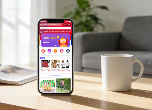 Well-Recognized Custom E-Commerce Mall System Dev
The Good Shopping mini-app is natively buil ...
-
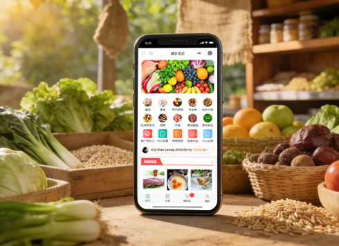 Anhui Huixiang Vegetable Garden Agricultural Products Mini Program v2.0 Iteration Development
HuiXiang MiniApp V2.0: Upgraded homepage, n ...
-
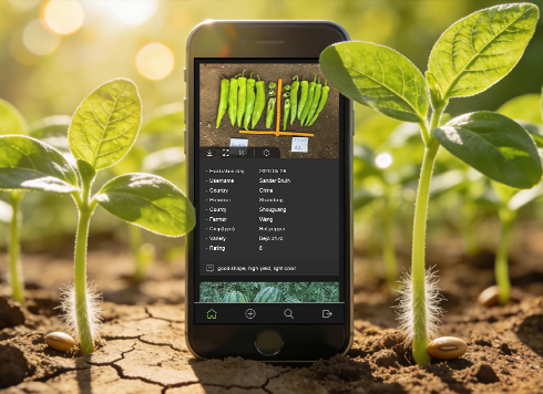 Kunshan TrialBook Mini-Program Custom Development
This project developed an English-only Tria ...
-
 Agricultural Products WeChat Mini Program Custom Development
Lvran Di enhances agricultural sales via a ...
-
Order success page popped for users, but the event tracking report is short of backend orders—is the client missing events, or is reporting being cut off by the system?
Date: Oct 14, 2026 Read: 8
-
Phone overheats and drops frames after scrolling dozens of screens of product images—is the phone too old, or is the image loading pipeline misaligned?
Date: Oct 13, 2026 Read: 11
-
Order date shows one day earlier overseas: is it really the phone time zone setting?
Date: Oct 12, 2026 Read: 21
-
User clicked submit once, but two identical order requests appear in the backend logs—which side should you check first?
Date: Oct 11, 2026 Read: 21
-
The photo preview is upright when picked from the album, but lies flat as soon as it's uploaded to the App — is the compression step losing the orientation?
Date: Oct 10, 2026 Read: 24